ZARA
Redesign Concept
Introduction
Team Members: Isabella L, Hunter I, Larry M
My Role: Lead UI Designer | Duration: 2 Weeks | Project Status: Done | Tools: Maze, Figma, Photoshop, Canva
Executive Summary
As the lead UX designer, I collaborated with a team of UX designers, UX researchers, and project managers to enhance the user experience of Zara's application. Our comprehensive redesign initiative targeted critical areas for improvement, including navigation, accessibility, and product discovery. We introduced three new components: a prominent “QR Scanner” for in-store shoppers, a "Shop by Influencer" feature for direct outfit browsing, and an "Express Checkout" feature for streamlined payments.
By refining the existing features, such as navigation and icon bar, and addressing usability concerns, we ensured a more intuitive browsing experience. We also fixed accessibility and contrast issues to accommodate users of all abilities and reorganized categories while adding filters for efficient product discovery.
The introduction of the QR Scanner, elevated in prominence, facilitated seamless access to additional product information for in-store shoppers. The "Shop by Influencer" feature simplified the shopping process by allowing users to directly browse and purchase outfits worn by fashion influencers within the app. The implementation of the "Express Checkout" feature expedited payments, saving users time and minimizing friction during the checkout process.
Throughout this case study, our collaborative efforts as UX designers, UX researchers, and project managers drove these enhancements' successful redesign and implementation. By prioritizing the user experience and leveraging our diverse skill sets, we aimed to provide Zara customers with an enhanced and seamless shopping journey, reflecting the brand's commitment to delivering trendy and affordable fashion worldwide.
Research
Methodology
Our initial step was to send out ten surveys, and most participants were between the ages of 26-32. We also conducted six user interviews and prepared ten open-ended questions, concentrating on our target audience’s goals, needs, and frustrations.
Survey Takeaways:
We gathered our data and came up with the following takeaways:
How Often Users Shop At Zara
interview Takeaways:
We provided three high-level takeaways from our interviews highlighting the user's pain points:
User Persona:
This led to our user persona, Alex. She is a 26-year-old social media manager based in New York City. She's passionate about fashion and loves to wear the latest brands. She keeps an eye on her social media and shops on her phone. Alex doesn’t mind finding the perfect outfits.
Frustrations
I don’t like not knowing if the information I’m looking at is accurate
"I really hate how hard it is to do anything on that site; it's too artsy. Even scrolling is difficult"
Goals and Needs
"I like to have a clear and easy way to browse similar items."
I want a way to look through clothes quickly and easily.
Problem Statement:
After we gathered our information, we developed a problem statement. With our persona in mind, our final problem statement was:
Alex needs a virtual shopping experience that provides well-fitting and stylish clothes to avoid endless returns and confidently showcase her fashion sense.
Competitive Analysis
Takeaway 1
Many e-commerce sites have visible like / save for later features.
Takeaway 2
Most competitors have a more robust and accurate sizing survey.
Takeaway 3
Most companies that have a brick-and-mortar and e-commerce presence have a more helpful process for a "scan-and-save" feature.
Takeaway 4
Most e-commerce sites have much more navigable home pages with less confusing visuals
Zara , H&M , Redesign
Zara , Lulus , Redesign
Zara , Walmart , Redesign
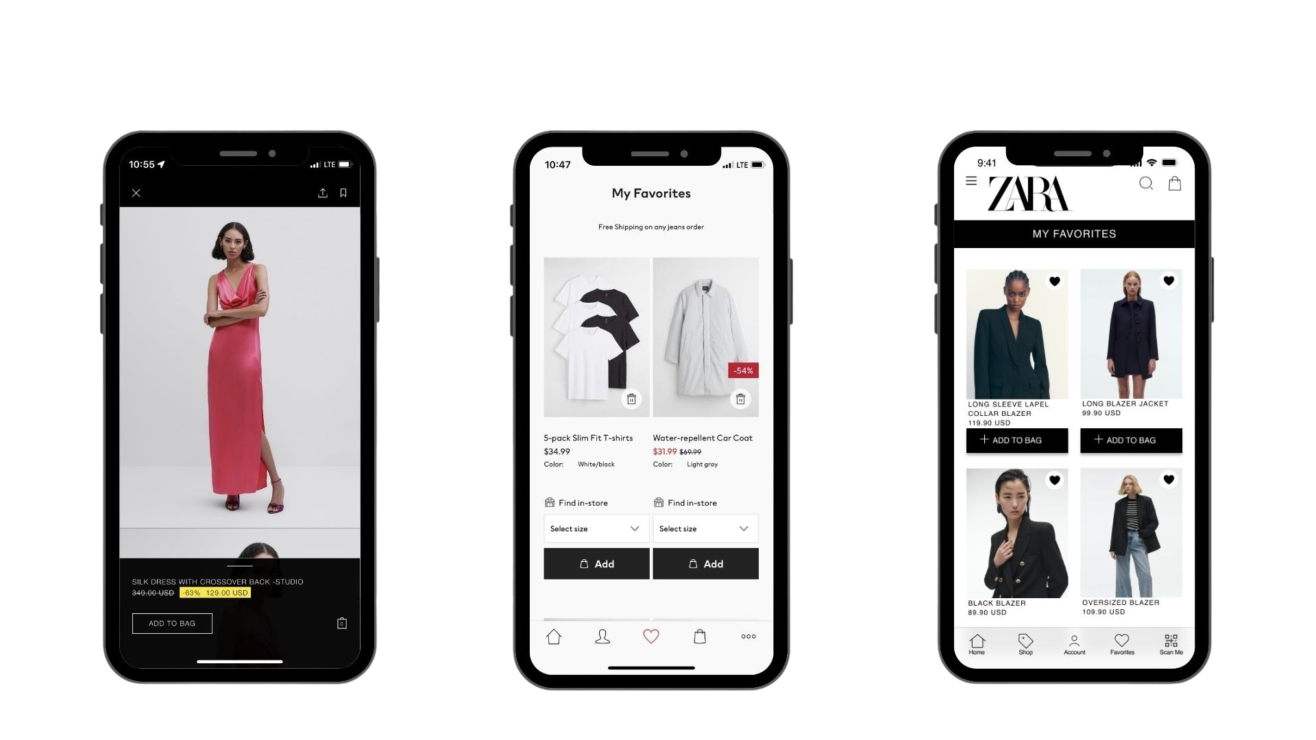
Like & Save Feature
We wanted to make the "like feature" more visible, and competitors like H&M included it on the navigation bar, so we incorporated that into our re-design.
Sizing Guide
We wanted to make the sizing guide more robust to ensure users get the most accurate results.
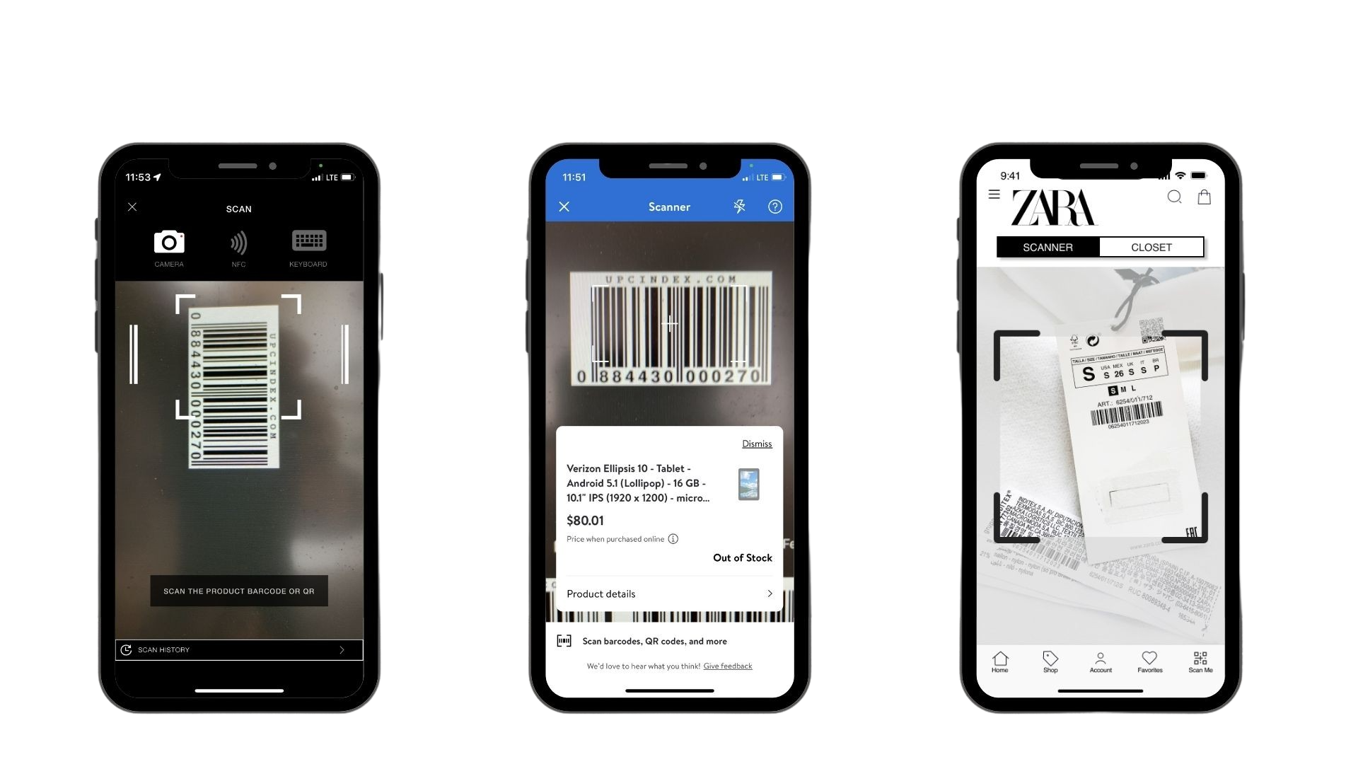
QR/ Barcode Scanner
The current Zara app takes five steps to get to the Scan in-store feature, and we wanted to make it more accessible for users with one step.
Wireframes
Our team conducted a design studio and developed a couple of sketches we wanted to move forward with. Using Figma, we designed mid-fidelity wireframes to help us focus on researching and refining the basic structure and layout of the design. We explored and iterated on our initial thoughts quickly and efficiently.
Usability Testing & Iterations
After prototyping each wireframe, we were ready to conduct our usability testing before going into the Hi-Fidelity prototype. We have conducted usability tests for both paths on Maze. Our team recruited 10 participants, but only nine participated in the testing. However, seven users completed each task successfully. Which resulted in our final data:
These were our takeaways:
Takeaway 1
Most of the usability errors were due to prototyping and vague instructions.
Takeaway 2
Some users wanted "express pay" on the product screen.
Takeaway 3
We alphabetized the "coats & jackets" category.
Takeaway 4
We refined our pop-ups to be more precise.
Following our usability tests, our team began to iterate and develop the final Hi-Fidelity prototype. Below are the current Zara website and our re-design highlighting everything our team changed on the app.
Current App
Our Redesign
New Features Added
QR Scanner
Shop by Influencer
Express Checkout
QR Scanner:
Zara already has a QR scanner on their current application, but we wanted to place it in the forefront for easier access for shoppers in the store.
Shop by Influencer:
Shopping by influencers could make it easier for users to shop for their looks directly on the app. How often do some of us try to get inspired by a photo we saw on Pinterest or Instagram and wonder where they purchased it? Sometimes influencers tag it, but returning to their profile and checking can be a mission. Let's get inspired directly on the Zara app and make shopping a breeze.
Express Checkout:
We added express checkout on the app to let users breeze through the payment process, saving users time and hassle. Select your preferred payment method, review your order, and you're done!
Protoype
Next Steps
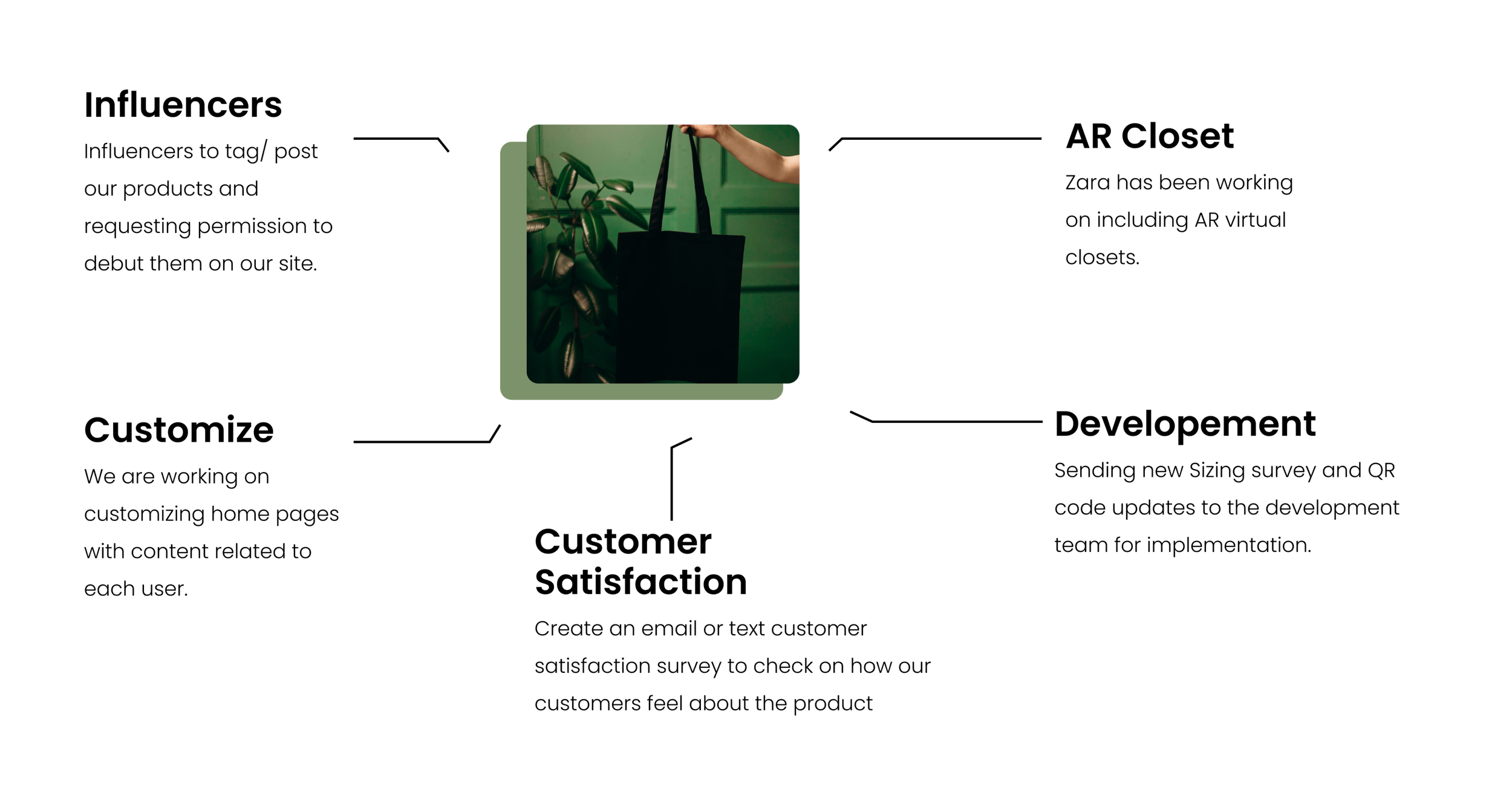
Theoretically, our next steps would be to work with influencers to tag/post Zara products and request permission to debut them on our site.
Zara has been working on including AR virtual closets, and the next steps would involve adding them to the app. Regarding the current AR technology, our team would like to incorporate that to customize user home pages with related content.
Our final step as a team would be to send the new sizing survey and QR code updates to the development team for implementation and create an email or text customer satisfaction survey to check how customers feel about the product.


